Rentals Ug Redesign
Rentals UgOverview
Rentals Ug is a web application that lets users easily find and book new rentals of their preference. The company consists of a small team of Ugandans who had struggled to find new housing.
My work with the team was to redesign the landing page Rentals Ug web application reporting directly to, Joseph one of the founders.
Tools
Paper & Pen, Sketch, Zeplin
My Role
I was contracted as a UX/UI designer and worked closely with one of the founders.
Research, Competitive Analysis, Sketching & Prototyping, Usability Testing
Jun 2020
Company

Challenge
“When I was looking for my first rental, I put in so much work, checking out different houses and having to cover transportation and search costs for the broker. It was so disturbing that I ended up settling for something unpleasant just to avoid putting in more money & effort” - Joseph.
Rentals Ug team was building a web app to help people avoid the same kind of stress when looking for rentals, and wanted to redesign their current landing page with better Visual and User Experience design.
Outcome
I relied much on the data from the interviews and usability tests to evaluate the success of this project. This helped me gain a deeper understanding of user behavior and goals when they're searching for a new house.
With the redesign, users were able to understand what the web application was about just on the landing page.
Coming up with a proposal
Research
I interviewed 2 of my peers to get a better understanding of their past experience when searching for a new home. During the same month, I was also searching for my first house and I went through mostly the same process of;
- i). contacting a house broker referred by a friend or family
- ii). stating the house and location preferences to the broker
- iii). visiting different houses with the broker and paying them off on every visit until you settle on something you might like
It’s also possible to settle for something you don’t like, especially when tired of visiting so many houses.
I tested the current design with them and used the results to distill their behaviors and listed a few design solutions.

Competitive Analysis
Based on the interviews, I examined several apps that were providing the same service, focusing more on there house listing, search, and filter experience.
There were a couple of competitors out there, I concentrated on mostly Ugandan competitors
Redesign
According to the research, I looked at three different aspects of the existing product to improve on.
Search:
Although the current search was a little adequate for some users, others weren’t able to understand what some fields like 'Single' meant at first glance, and they also had to manually enter the price range. I was looking to maximize the business’s impression, engagement, and ease of navigation for users.
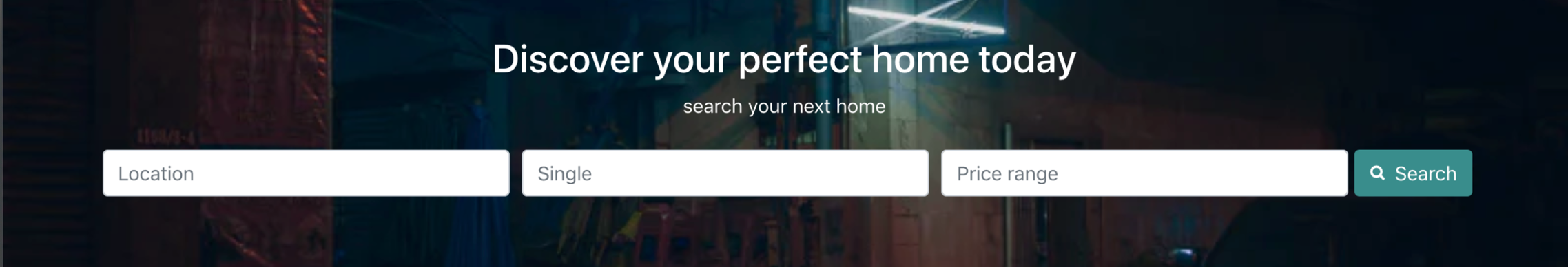
Current Design: fields without captions/ clear place holders, inappropriate types of input fields
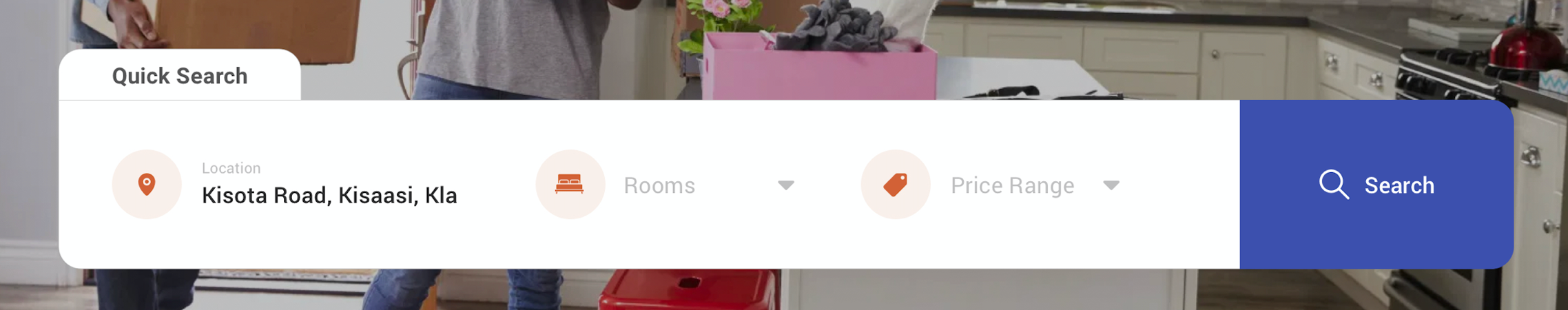
Proposed solution: Using icons, different types of fields (input fields and dropdown), and keeping the placeholder/caption after entering data in the fields while keeping everything as one
House Listing:
I focused more on the information displayed to the user about the house. Based on the interviews and research, users consider price range, location, number of rooms, bathrooms, available parking space, among others, when choosing a new house.
I summarised much of this information about the house specs on the card view without going into details.
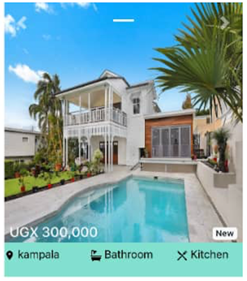
Current Design: displaying the price, location and bathroom plus kitchen
👉🏾
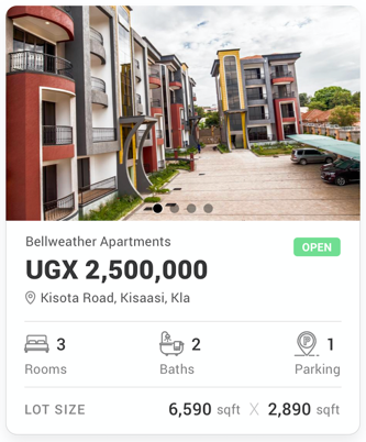
Proposed Solution: displaying the housing/apartments name, location, price(being prominent), number of rooms, bathrooms, available parking space and size of the lot
Visuals
To give the landing page a new feel and attachment to the real world, I used an image they can relate to at first glance when they land onto the web application.
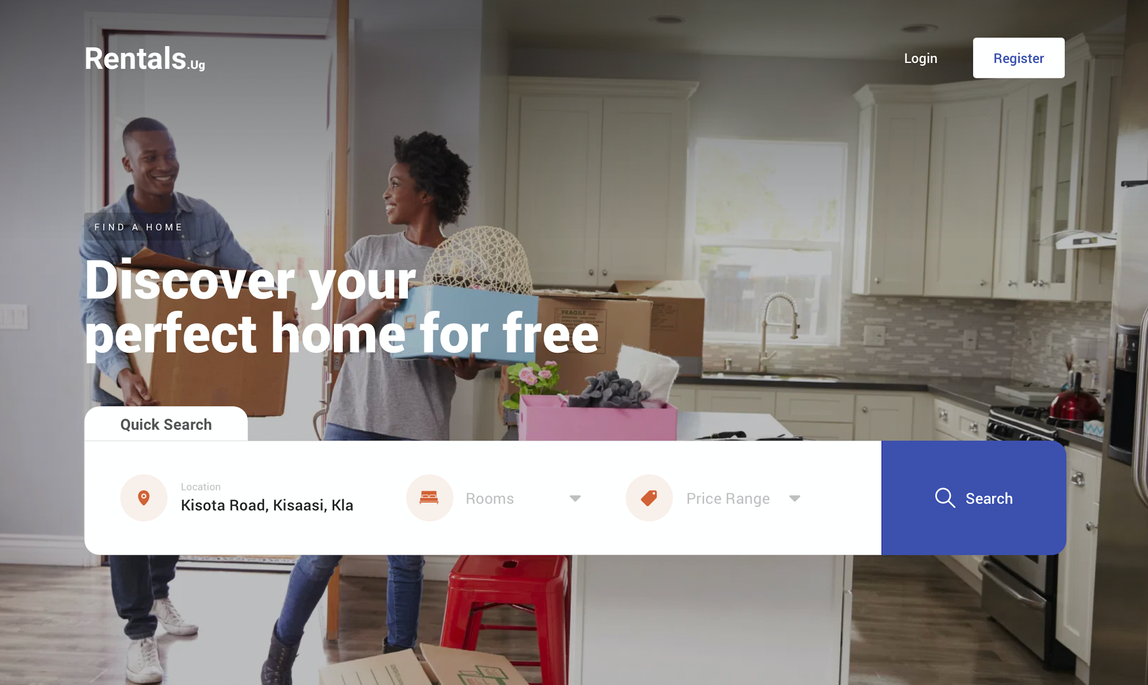
Using a more realistic Image: a more realistic image with a couple moving things into their new home I thought was the perfect balance for the landing page
Prototyping
After coming up with various design proposals, I critiqued each solution with a friend(product designer) to picked a solid solution for testing.
User Testing
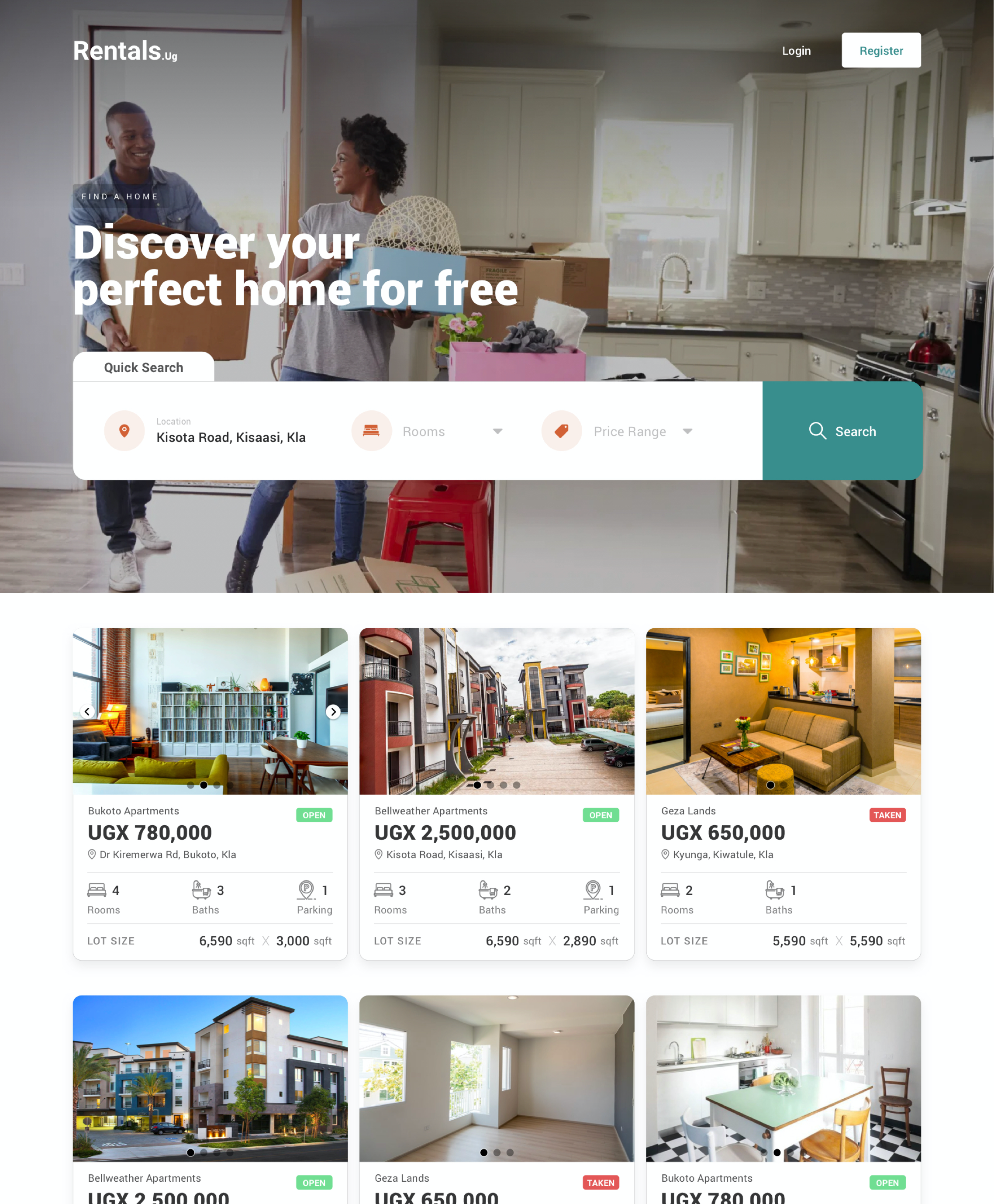
The goal of the usability test was to find out if users were able to understand what the web application was about at first glance, and if they can easily search or discover a new home.
The results were positive however, one of the users found it difficult to understand whether the house listing below was from the search results or suggestions from the application. To resolve this, I included a title for the house listing section.
I presented the solution to Joseph(one of the founders), and it was taken on by the team.
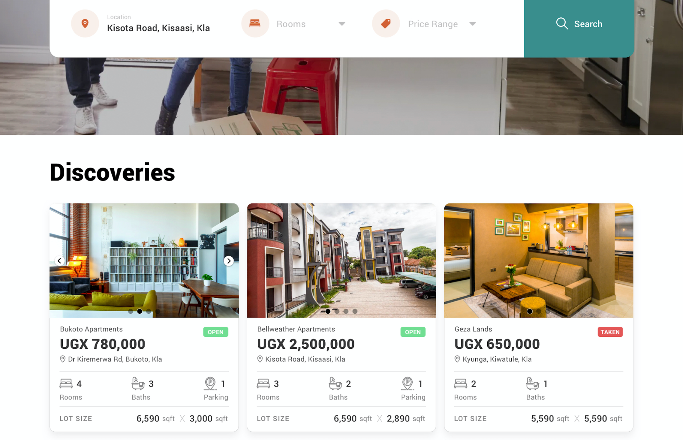
Proposed solution after usability testing: including a title for the suggestions. This was tested and the proposed solution resolved the issue of miss-understanding whether the house listing below were the search results or suggestions from the application.
Challenges
Users have a variety of needs when searching for homes since different users have different preferences. However, there could be a common ground for the average number of users searching for homes.
Learnings
When creating an application that involves users’ time and money, it is by far very important to earn their trust at first glance. The first impression always marks the last; the experience might be better, but if at first glance the visual design portrays mistrust or looks disorganized, unprofessional, and incomplete to users, they might not even try out the experience.
During my search for my first house, I got to understand a few struggles house brokers go through and captured a few reasons as to why they offer unpleasant experiences. Some brokers are more interested in the money than helping the user as they try to equivocate and convince them to pick options they don’t prefer all in hopes of getting quick payouts from both the user and the landlord.
Conclusion
Working on this project was exciting, and it was even more exciting after seeing the solution implemented. As a designer, I feel humbled seeing proposed design solutions to problems out there helping users.

Being the savage's bows-man, that is, the person who pulled the bow-oar in his boat (the second one from forward), it was my cheerful duty to attend upon him while taking.