Redesigning Mobile Design System
SafeBodaOverview
SafeBoda is a boda-boda(motorcycle) hailing company improving the welfare and livelihoods in Africa. The SafeBoda mobile app offers many diverse services ranging from Ride-hailing, Package & Food Delivery, Shopping among others, and could be on it’s way to becoming a super app.
Part of my work on the SafeBoda Apps was redesigning the design language for mobile apps(iOS and Android).
To comply with the company's non-disclosure agreement, I have omitted and obfuscated confidential information in this case study. Therefore, all information in this case study is my own and does not necessarily reflect the views of SafeBoda.
Tools
Paper & Pen, Sketch, Zeplin, Sketch Cloud
My Role
Product Designer
Research, Design, Testing, Deploying
May - Jul 2020
Company

The challenge
Designing with the current library, was at times an inconsistent process because of the inconsistent icon style(s), components, naming conventions, missing symbols, and abstruse architecture.
I aimed to create a simple, clean, and clear design library with consistent reusable components that could be shared within the design team and make conversation with developers more efficient.
Outcome
Overall, this project was more about setting up a library for teams to use across the company to move faster while designing & developing.
With the new design system, the team have plugged into this library and utilized these components while designing new features.
Getting started
Research
How does one create a design system for both iOS and Android apps? 🤷🏾♂️ I didn’t know either, so I started with some substantial research, reading articles, Material Design guidelines, iOS guidelines, and YouTube tutorials.
Credit: Christopher Deane for the amazing Design System tutorials on YouTube.
Experimenting and stress testing components & styles from the existing Design System
Design Exploration
I explored every UI element in the applications(iOS & Android), taking screenshots, existing components, icons, and everything I landed on. I also experimented with the existing Design System, discovering, and stress testing styles, components, and patterns.
It’s important to note that the redesign direction of this system was greatly inspired by the Apple iOS UI Sketch Library(found in their Human Interface Guidelines) since it has a great structure and naming convention.
I noticed why we needed to redesign the existing Design System after capturing every button, icon, design patterns, and clustering them into separate categories. There were incorrectly applied font styles, weights, and inconsistent icon style(s), among others.
Redesign
One of the largest portions of my work included redesigning icons, components, agreeing on a naming convention with the team, and organizing the architecture.
Since the Agile working style is unforgiving, I had to jump on other higher priority tickets and continue with the Design System with time. Design Systems are not something to joke about as they consume a lot of time to create and review, but thanks to Christopher Deane’s tutorials, I found a lot of sketch plugins to ease some of my work like Rename It.
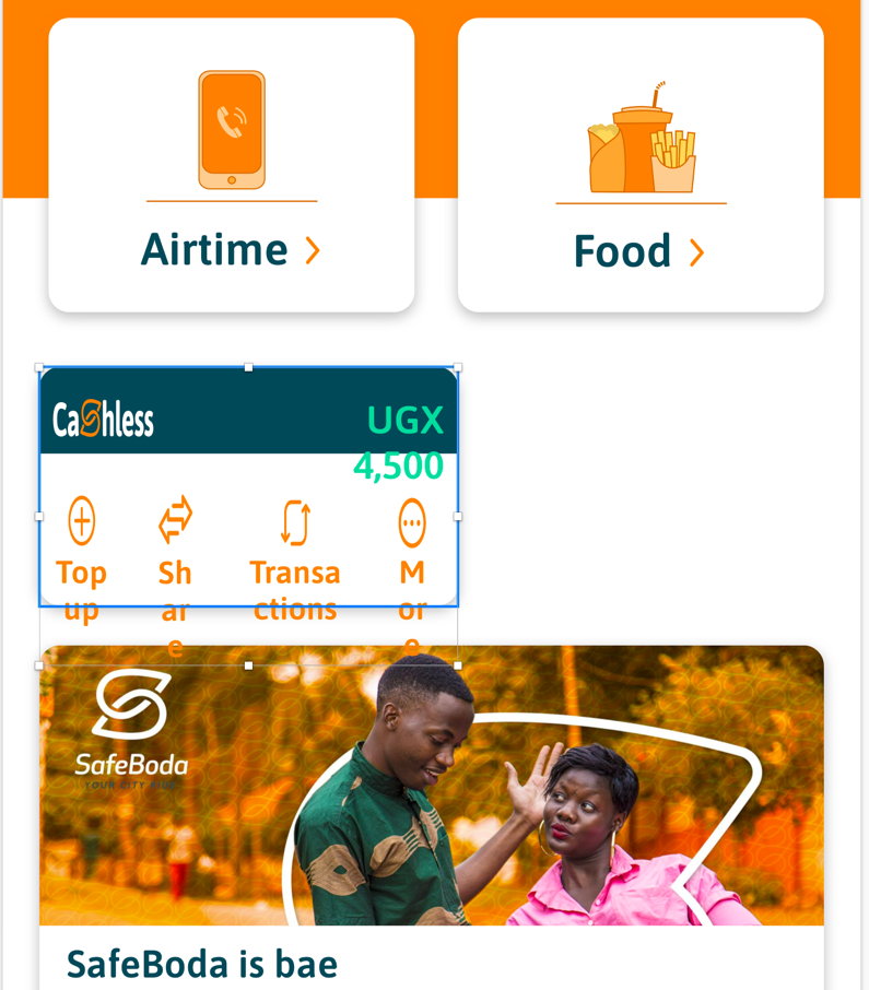
Icon Suite
I wanted to improve the consistency, simplicity, and elegancy of the old icon suite but stay bold, original, and still reflect the SafeBoda brand.
Some core improvements included: (1) consistent stroke width, (2) outlines over fill, (3)clean and simple shapes, (4) rounded edges to follow the rounded typeface
Colors
Colors used in the app are orange, which is the primary color, dark orange, sea green, mint, dark grey, light grey, and gradient colors.

Some improvements included: using a spiral gradient other than ranging opacities
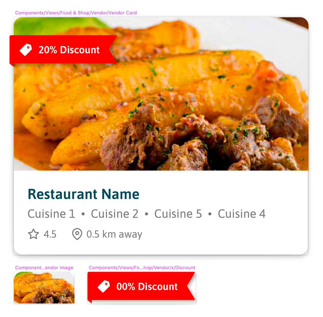
Components & Nested Components
I wanted to improve the consistency, simplicity, and elegancy of the old icon suite but stay bold, original, and still reflect the SafeBoda brand.
Some core improvements on the components included: creating atoms & molecules i.e components and subcomponents
Other improvements included: using other components to created nested components that are reusable and responsive
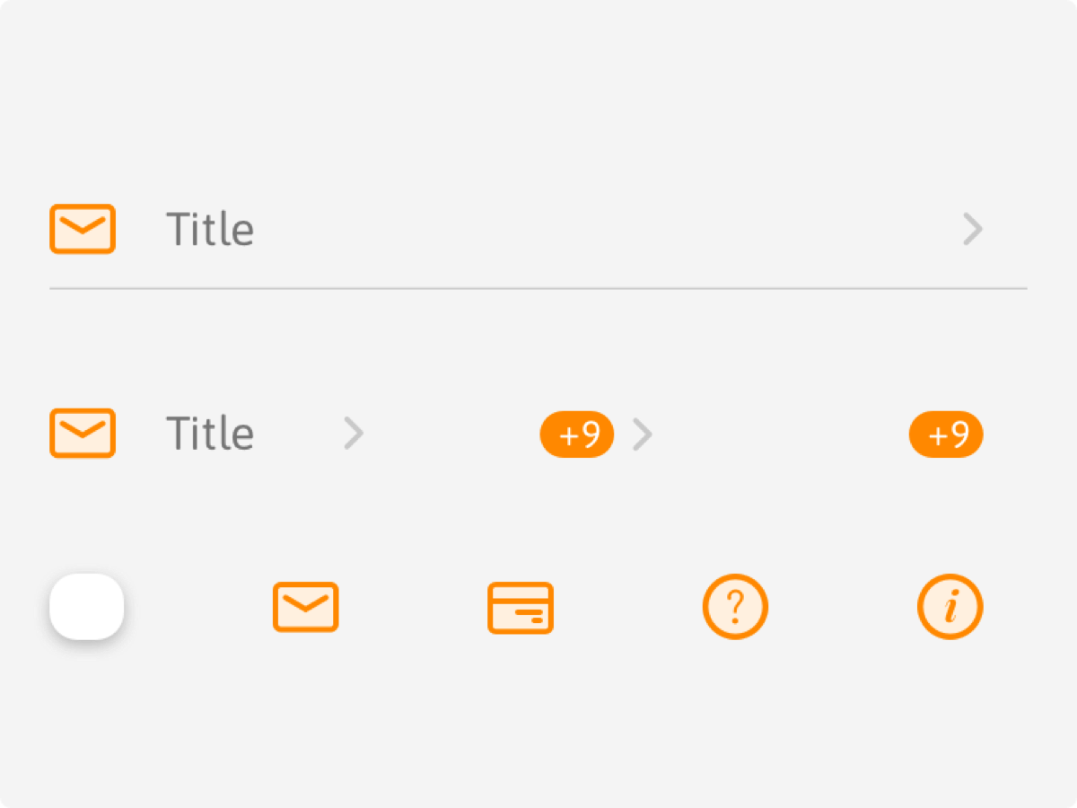
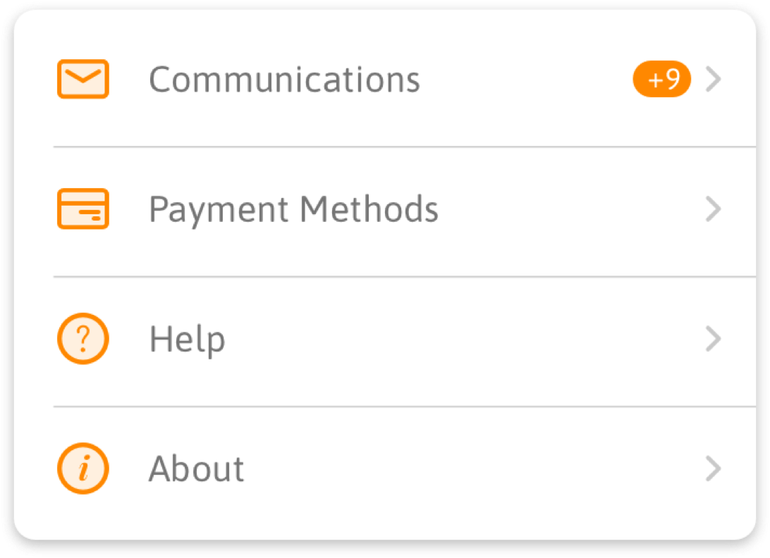
Naming Convention & Organisation
When creating a Design System, one of the goals should be to get designers and developers to speak the same language. This can be achieved with consistent, semantic naming convention everyone is familiar with, be it colors, font styles, components, or even art-board names.
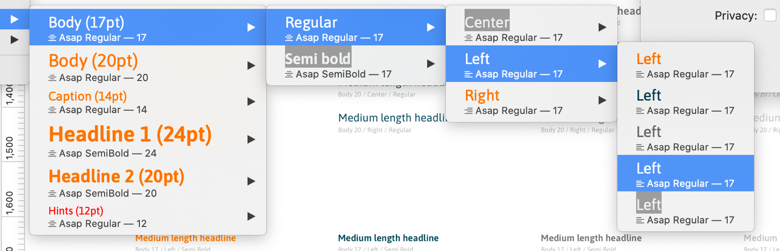
Naming convention and organisation structure: I got inspiration from Apple iOS UI Sketch Library(found in their Human Interface Guidelines) to come up with these
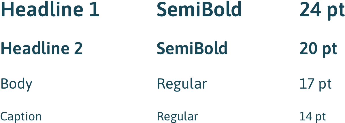
Typography
The font type used in the app is "ASAP" in Regular and Semibold weight.
This typeface gives a feeling of guilelessness, simplicity, and professionalism at the same time.
User Testing
I started internal experiments and tests with the design team on the Design System, where it would be applied, discovering, stress testing style(s), patterns, components, reusable components & their responsiveness.
The results of the tests were positive.
Creating the Power Template
After the redesign, I added the library on the cloud so it could easily be applied to the design files, and this was far more efficient as any changes made to the master library would be synced to any design files using it. And luckily, Sketch’s editable symbols and text styles also make it simple to distribute and maintain the design system at any time.
For the interest of consistency in the apps, the newly redesigned Design System had to be as simple as possible for the team to use.
Challenges
Having the same visual style, staying consistent with the designs and naming conventions while designing with constraints, all these made the work seem a lot. However, taking one step at a time can help you move the long journeys.
Learnings
Simplicity is strength
We love beautiful, trendy, and out of the box icon designs, but as designers, we have to always remember ‘why’ we want a redesign. One of the primary goals was to resolve the inconsistency of icon styles.
Designing with constraint
I was forced to stay creative and design with an open mind, but at the same time, stay true to my goal(a simple, clean, and clear design library).
Conclusion
A Design System keeps evolving, growing, and changing with the product. You don’t just jump into Sketch to create a Design System, it takes an effort to create one that’s consistent and fits with the product/business goals. It was amazing to learn how to create a Design System on the go, exploring the Sketch app, and it’s plugins.